How we got to flat design
Up till about 2007 the design imperative was to convey interactivity and familiarity. That meant buttons, bubbles, huge drop shadows and shiny stuff.
Round 2007 Apple really started pushing skeumorphism, and the iPhone brought that to the masses. The iPhone was a totally new form factor -it needed to be totally intuitive, to show clearly what could be tapped and what couldn’t, and what stuff did. The apogee of skeumorphism was around 2010.
The flat design pioneers… Microsoft (!) and Google
By 2010, there was mass adoption of mobile and web design. People were comfortable with these interfaces, used to interactivity and had internalised this new set of UX and interface expectations.
At the same time the iPhone competitors were desperate to break out of an Apple-dominated design language.
Flat design was their answer – Google had a massive design push round this time, it started experimenting with flatter interfaces and card based organisation (which just reached maturity with Google Now). Meanwhile Microsoft came out with the Metro UI, which was like a totally flat mosaic-type interface. Both of these were a reaction to loud, busy and in-your-face skeumorphism, it took a while for this new language to mature.
Apple late to the game
With the announcement of ios7, Apple finally makes flat design mainstream. Three years late to the game, they are going to have to try to recapture the initiative. Parallax seems to be the only USP they’ve come up with so far.
Nevertheless, the pendulum has swung in the opposite direction.
‘New’ flat design principles:
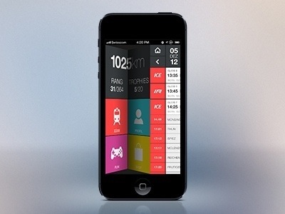
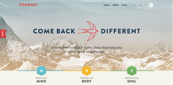
1) Simplicity, minimalism and clean design
2) Clean and elegant typography and lines (made possible by high-res displays)
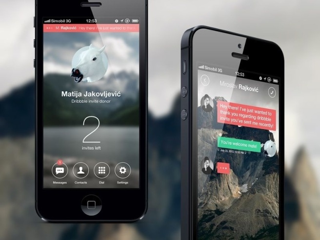
3) Increased use of layers, especially to indicate context
4) Gesture based interfaces
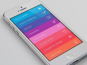
5) Flat colours, and pastels
What survives?
Some principles will hopefully survive, particularly the ones that don’t clash violently with flat design principles. For example depth and shadows will continue to be used, though they will be much more subtle. More importantly, some level of affordance needs to remain as a permanent feature. Without it, interaction expectations would need to be even more strictly conformed to for apps to remain intuitive – necessarily limiting experimentation and evolution. Totally flat design (ie metro interface) is as bad as skeumorphic overkill. There’s a happy medium to be found.
Overall, flat design is going to be a UX challenge in that designers will need to make flat interfaces feel alive and responsive with only the most subtle and ambiguous of visual clues (ie colour, placement, and fluidly evolving design expectations). It wont be easy. We need to strike the right balance between keeping the best of skeumorphism (some ornamentalism, friendly and approachable design), rejecting the worst (warping a digital interface into it’s analogue counterpart); introducing the best of minimalism (stripped down, fast-loading and simplified design) and keeping out the worst (cold, emotionless, intimidating screens).
What’s next?
Today we have mobiles, phablet, tablets and desktops, but the major hardware companies are all working on next generation devices – watches, glasses, bracelets and other wearables, household devices like Nest, touchless interfaces like Leap Motion and voice interfaces like Siri… It is these new interface formats that are going to push the user interface envelope, and new standards and expectations will necessarily emerge, and best practices will merge with other interface formats.
Over time, complexity always seems to efface itself. The same will be true of the user interface. Navigation is becoming invisible, button are blending into the background, and gestures and colour are taking their place. Look for more of this, particularly gestures.
Right now flat design seems new and exciting, but it wont be modern forever. Increasing user familiarity with digital interfaces combined with the emergence of new interface formats will drive the next iteration of design language.